
On IPCCs exaggerated climate sensitivity and the emperor’s new clothes
Blog topic:
Normal science progresses through the collection of observations (or measurements), the conjecture of hypotheses, the making of predictions, and then through the usage of new observations, the modification of the hypotheses accordingly (either ruling them out, or improving them). In the global warming “science”, this is not the case.
What do I mean?
From the first IPCC report until the previous IPCC report, climate predictions for future temperature increase where based on a climate sensitivity of 1.5 to 4.5°C per CO2 doubling. This range, in fact, goes back to the 1979 Charney report published by the National Academy of Sciences. That is, after 33 years of climate research and many billions of dollars of research, the possible range of climate sensitivities is virtually the same! In the last (AR4) IPCC report the range was actually slightly narrowed down to 2 to 4.5°C increase per CO2 doubling (without any good reason if you ask me). In any case, this increase of the lower limit will only aggravate the point I make below, which is as follows.
Because the possible range of sensitivities has been virtually the same, it means that the predictions made in the first IPCC report in 1990 should still be valid. That is, according to the writers of all the IPCC reports, the temperature today should be within the range of predictions made 22 years ago. But they are not!
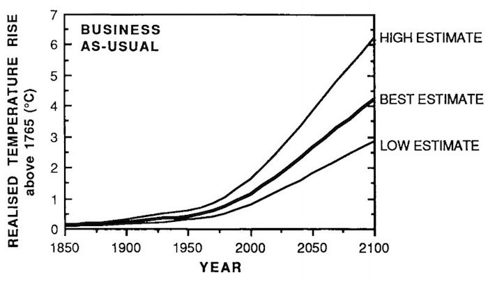
The business as usual predictions made in 1990, in the first IPCC report, are given in the following figure.
How well do these predictions agree with reality? In the next figure I plot the actual global and oceanic temperatures (as made by the NCDC). One can argue that either the ocean temperature or the global (ocean+land) temperature is better. The Ocean temperature includes smaller fluctuations than the land (and therefore less than the global temperature as well), however, if there is a change in the average global state, it should take longer for the oceans to react. On the other hand, the land temperature (and therefore the global temperature) is likely to include the urban heat island effect.
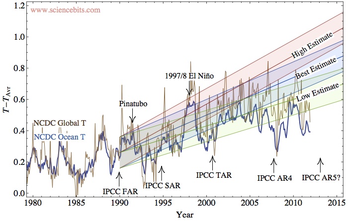
From the simulations that my student Shlomi Ziskin has carried out for the 20th century, I think that the rise in the ocean temperature should be only about 90% of the global temperature warming since the 1980's, i.e., the global temperature rise should be no more than about 0.02-0.03°C warmer than the oceanic warming (I'll write more about this work soon). As we can see from the graph, the difference is larger, around 0.1°C. It would be no surprise if this difference is due to the urban heat island effect. We know from McKitrick and Michaels' work, that there is a spatial correlation between the land warming and different socio-economic indices (i.e., places which developed more, had a higher temperature increase). This clearly indicates that the land data is tainted by some local anthropogenic effects and should therefore be considered cautiously. In fact, they claim that in order to remove the correlation, the land warming should be around 0.17°C per decade instead of 0.3. This implies that the global warming over 2.2 decades should be 0.085°C cooler, i.e., consistent with the difference!
In any case, irrespective of whether you favor the global data, or the oceanic data, it is clear the the temperature with its fluctuations is inconsistent with the "high estimate" in the IPCC-FAR (and it has been the case for a decade if you take the oceanic temperature, or half a decade, if you take the global temperature, not admitting that it is biased). In fact, it appears that only the low estimate can presently be consistent with the observations. Clearly then, earth's climate sensitivity should be revised down, and the upper range of sensitivities should be discarded and with it, the apocalyptic scenarios which they imply. For some reason, I doubt that the next AR5 report will consider this inconsistency, nor that they will revise down the climate sensitivity (and which is consistent with other empirical indicators of climate sensitivity). I am also curious when will the general public realize that the emperor has no clothes.
Of course, Andrew commented that the alarmists will always claim that there might be something else which has been cooling, and we will pay for our CO2 sevenfold later. The short answer is that “you can fool some of the people some of the time, but you cannot fool all of the people all of the time!” (or as it should be adapted here, “you cannot fool most of the people indefinitely!”).
The longer answer is that even climate alarmists realize that there is a problem, but they won’t admit it in public. In private, as the climategate e-mails have revealed, they know it is a problem. In October 2009, Kevin Trenberth wrote his colleagues:
The fact is that we can't account for the lack of warming at the moment and it is a travesty that we can't. The CERES data published in the August BAMS 09 supplement on 2008 shows there should be even more warming: but the data are surely wrong. Our observing system is inadequate.However, instead of reaching the reasonable conclusion that the theory should be modified, the data are "surely wrong". (This, btw, is a sign of a new religion, since no fact can disprove the basic tenets).
When you think of it, those climatologists are in a rather awkward position. If you exclude the denial option (apparent in the above quote), then the only way to explain the “travesty” is if you have a joker card, something which can provide warming, but which the models don’t take into account. It is a catch-22 for the modelers. If they admit that there is a joker, it disarms their claim that since one cannot explain the 20th century warming without the anthropogenic contribution, the warming is necessarily anthropogenic. If they do not admit that there is a joker, they must conclude (as described above) that the climate sensitivity must be low. But if it is low, one cannot explain the 20th century without a joker. A classic Yossarian dilemma.
This joker card is of course the large solar effects on climate.
Comments (52)
I fixed it. The problem was that the editor I wrote the article in, converted the normal quoted to curly quotes, and the browsers don't like...
"This joker card is of course the large solar effects on climate."
Would be nice to add a link to the data that confirms this statement.
Well, the oceans unequivocally demonstrate that the solar contribution is 6-7 times larger than just the forcing of the solar irradiance variations (which is the only thing the IPCC considers). Look here: Oceans as a calorimeter.
Other candidate jokers
Another candidate for the Joker is coal soot. With the right fudge factors in the models this can account for the recent stall in warming.
Also, as Judith Curry says in the linked article, decadal changes in ocean circulation patterns may also explain some of the stalling.
http://www.sciencenews.org/view/generic/id/332152/title/Sulfur_stalls_surface_temperature_rise_
"Kaufmann says that when sulfur is removed from the analysis, the model falls apart. “Only sulfur aerosols can explain the recent pattern,”"
Did I just confuse soot with sulphur aerosols? Probably. Best read the linked article :)
Aerosols are indeed a big joker, since they can cancel out the effect of CO2. Nevertheless, as I pointed above in one of the comments, the oceans clearly demonstrate that the solar effect is there, and much larger than the effect considered in standard models.
I just read this on Joannenova. It's one of the best for simplicity of presentation and impact — the elephant in the parlor, so-to-speak.
Dr. Shaviv,
Just read this over on Jo Nova's site and thought I would drop by to say Thanks! Clear and to the point.
Thanks again,
Jim
Thank you for eloquent and concise essay. Must bookmark Prof Shaviv.
you're welcome.
Very clear. May I point out that the Pinatubo event (cooling) is incorrectly positioned on your graph.
Pinatubo erupted June 15, 1991. I tried pointing the arrow right between the 1991 and 1992 ticks. I think I got it right.
HI Dr Shaviv,
I expect you will cop a lot of flack for this article from the AGW sect but if the world is going to get back to focusing on the important things in life like lifting people out of poverty then people like yourself will need to declare that the Emperor has no clothes. Thankyou.
Nice blog BTW.
Thank you, Professor Shaviv
The only way, you argue, to explain Kevin Trenberth's "travesty" - namely that "we can't account for THE LACK OF warming" - in reality, compared with the models - is by the presence of a joker card in the climate change pack.
KT is adamant the lack of more (measurable) warming he expected is a consequence of "wrong data" and an "inadequate observing system". He dismisses any suggestion there could be something wrong ( incomplete) with the models.
You define a "joker card" as "something which can provide warming, but which the models don't take into account"; and state "this joker card is of course the large solar effects on climate."
You then go on to explain and expose the two horns of the catch-22 dilemma facing the modelers.
For clarity, perhaps your "joker card" should be defined as "something which can provide warming OR COOLING (absence of warming), but which the models don't take into account?"
Or perhaps it is the case that your joker - "the large solar effects on climate" - are variable and hence (by definition) they can operate in manner that produces both warming and cooling over time; and hence KT's "lack of warming"?
Alice
KT falls into the denial option I mentioned in the parenthesis. That is, he isn't even facing the aforementioned Yossarian dilemma.
And yes, the "joker card" can be something which can explain some of the 20th century warming (reducing the effect of CO2), or something which can provide cooling, to "offset" the effects of CO2. However, given the results I and others find, (e.g., this measurement of the solar forcing), there is certainly contribution of the first type (i.e., something else to explain at least part of the 20th century warming). Of course, being open minded I don't dismiss any contribution of the second type.
Hi Dr Shaviv,
A good and cogent argument and I thank Bolter for bringing your blog to everyday Australians
Thanks
again
Mick
Shalom Nir!
My main problem with all the climate issue is that the whole idea of "mean temperature" is meaningless, hence the debate about the temp. change is useless.
2 reasons:
1. (which is the minor one) The measuremnts of the world temp. are completely corrupt. Beginnig with inadequate thermometer placement, continuing with urban heat island, and worse of all - very poor spread of measure ponts. for instance- the poles are "measured" from thousands of kilometers away, by "smoothing" the data.
2. The main and insolvable problem (to date) is the complexity of the climate system which prevents any sort of modelling to be made.
I highly recommend Roger G. Brown's post in WUWT excellent blog :
(http://wattsupwiththat.com/2012/01/12/earths-baseline-black-body-model-a-damn-hard-problem/) Earth’s baseline black-body model – “a damn hard problem” where he shows the unbeleivable complexity of the system.
It seems to me a futile task to try and forcast about a system we know so lilttle about -let alone spend huge amounts of money on such a flimsy base.
The only thing we can do is continue our study and try slowly to find and explain the missing bits.
I like the picture presented as Fig. 2. If it is a chart, where is the data come from, I mean before 1980th. We have remount sensed data now (from satellites), buy how may we transform them in the temperature? The traditional air temperature is the temperature 2 m above the surface.
I'm not an AGWer. However I find the 2nd graphic on IPCC predictions against the observed temps confusing. Three predictions starting from the same point. It's just doesn't make clear sense to me. there could be a better selection of bolder graph colors that would make it clearer.
Thank You
I tried to show what is the reasonable range you would expect if the low, medium or high estimates of the IPCC FAR were correct. Since there are fluctuations, the predictions have a finite width. Perhaps this is a little confusing.
In the post you claim most convincingly that the business-as-usual predictions made in the first IPCC report, in 1990, are inconsistent with the observed temperatures to date.
But did business went as usual?
I mean, how far from reality were the assumptions made in 1990 regarding the future greenhouse gas emissions (disregarding the sensitivity issue)?
This alone can explain the inconsistency but I guess you have a ready answer.
Thanks for the insightful post,
Shlomi
To a large extent, the emissions where close to those predicted. So, the inconsistency is not a result of bad predictions of the emissions, but bad predictions for the climate sensitivity. However, I do think that once photovoltaic cells will be cost effect (in say about 15 years) there will be a big boom in non-subsidized photovoltaics that will start decreasing the emissions below those predicted in the "business as usual" case.
Pages